


Works

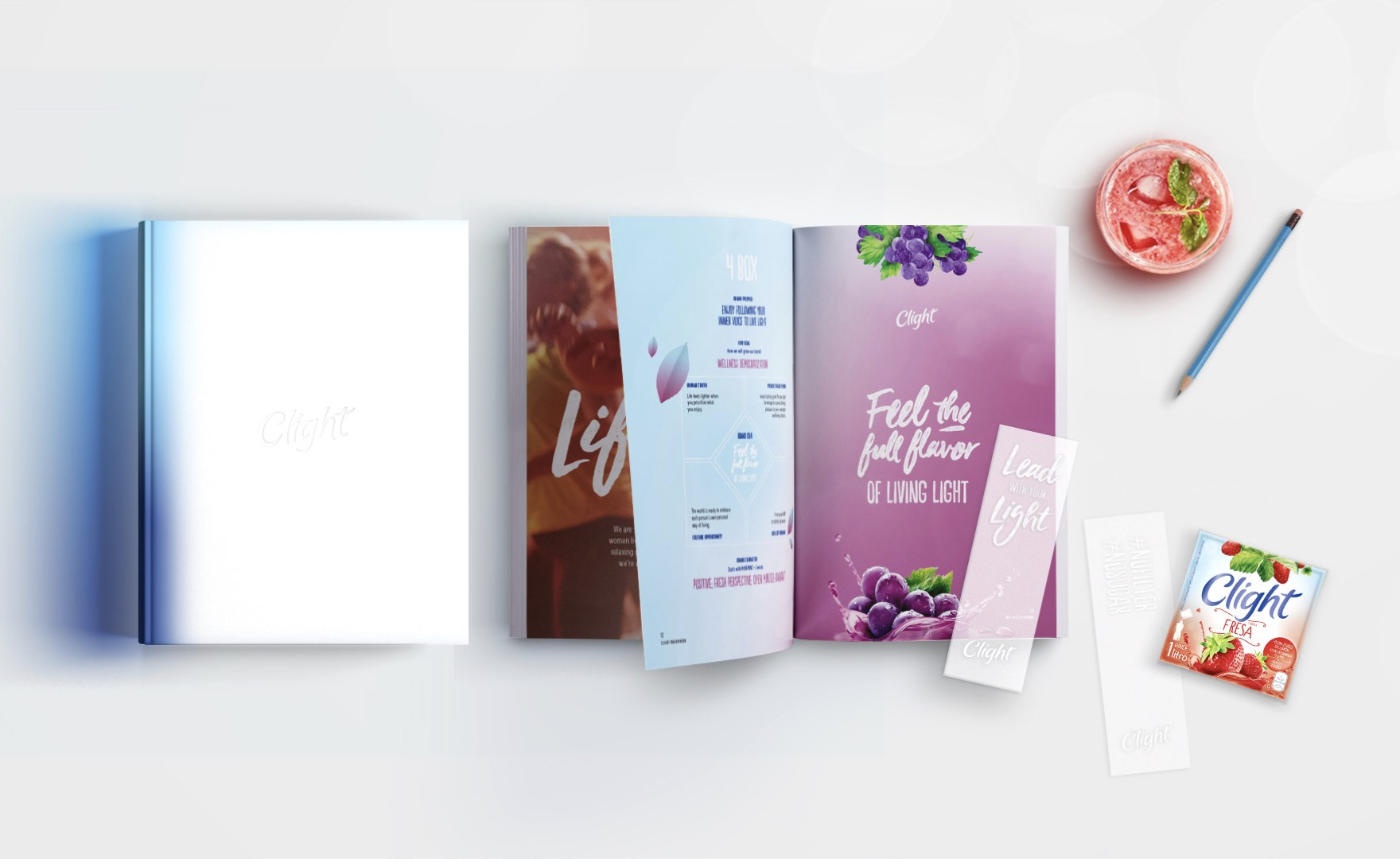
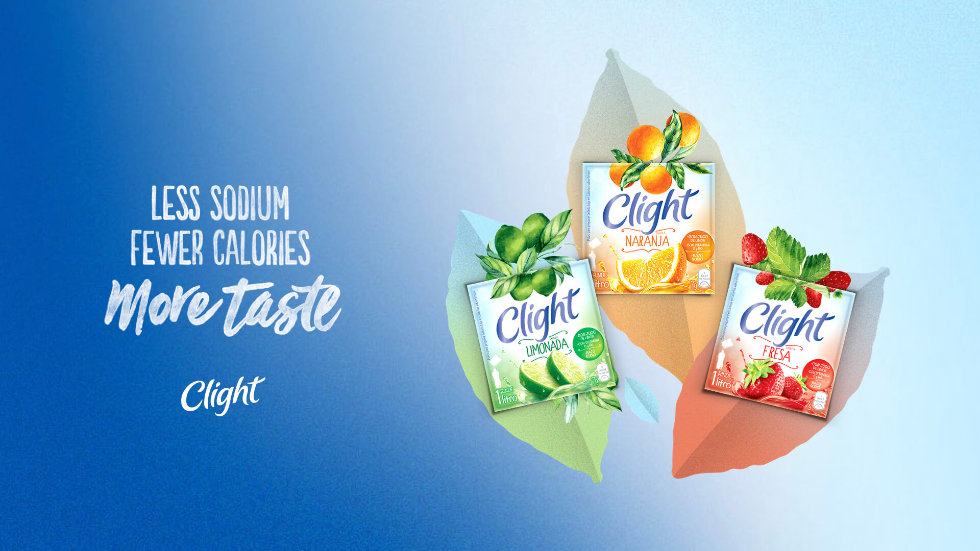
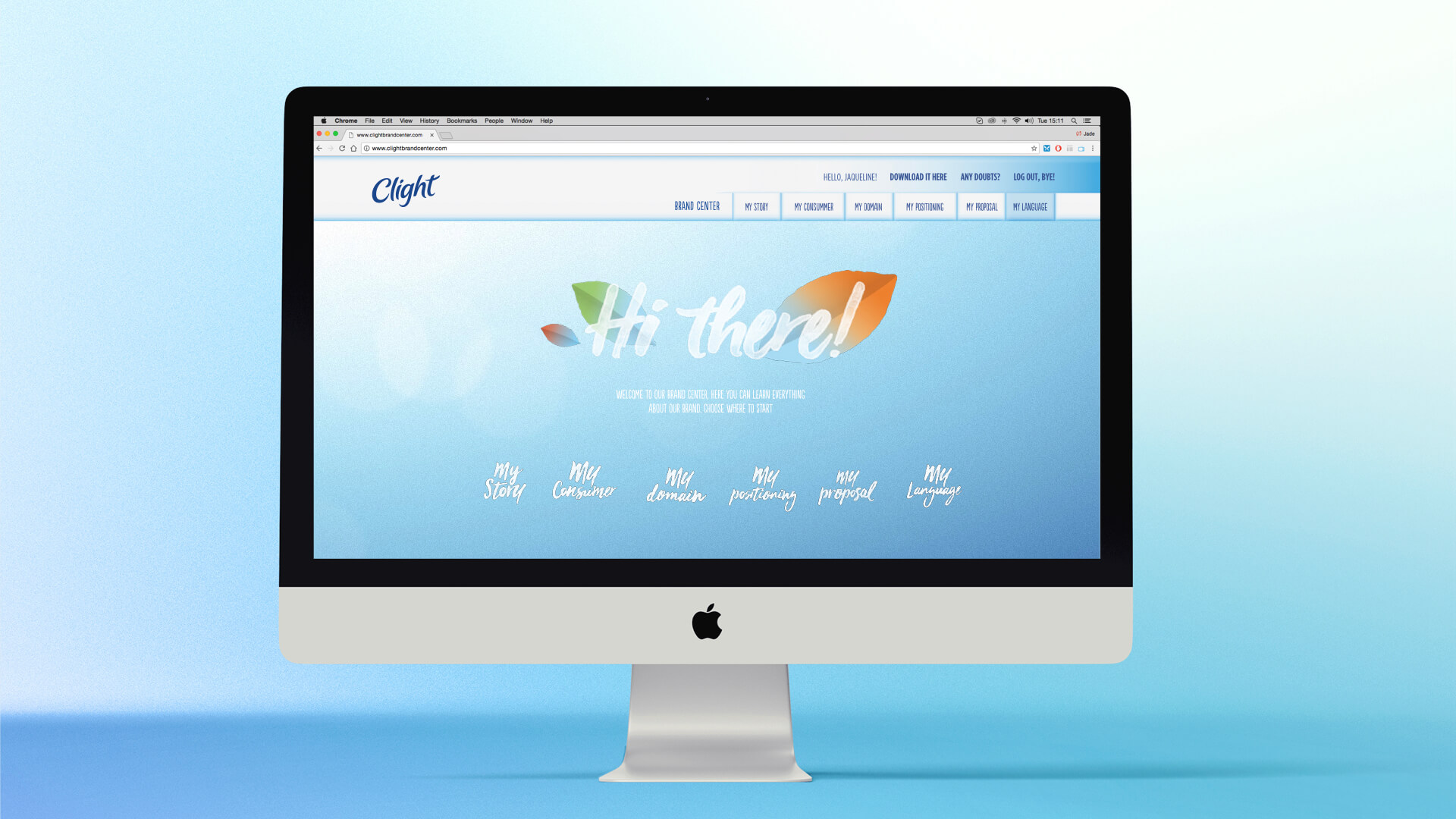
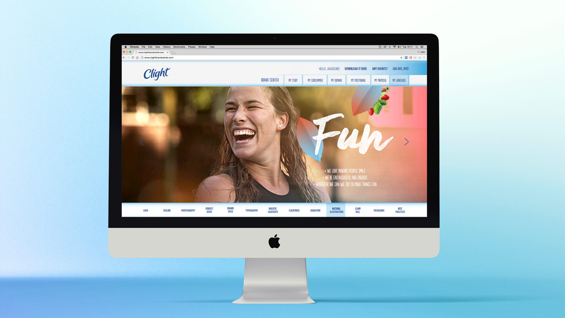
With the repacking of the brand Clight, we’ve been invited by Mondelez Mexico to develop its visual and verbal language, applied to all the countries in which it is present.

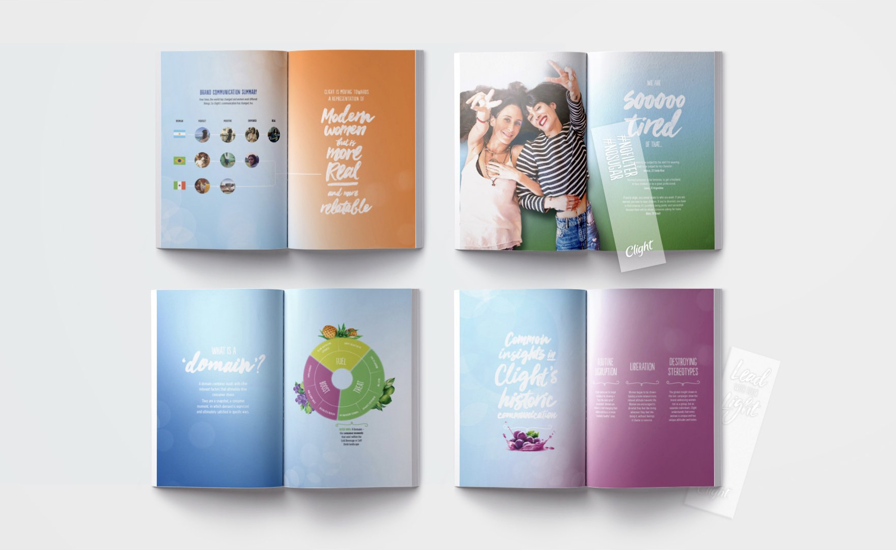
From the beginning we explored territories and cocreated our language along with many hands and with no frontiers between us and the client. We have gotten inspiration from Toshitaka’s work, a Japanese artist specialist in experimentation with light and color, focusing on minimalism.
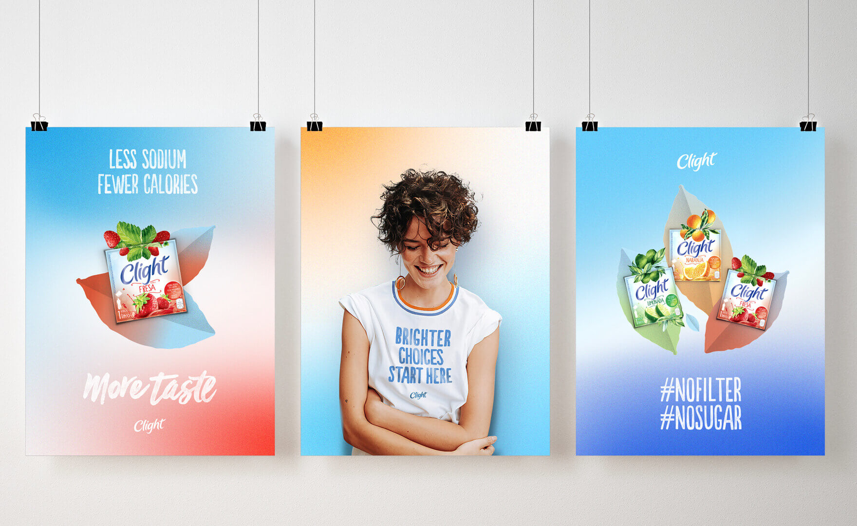
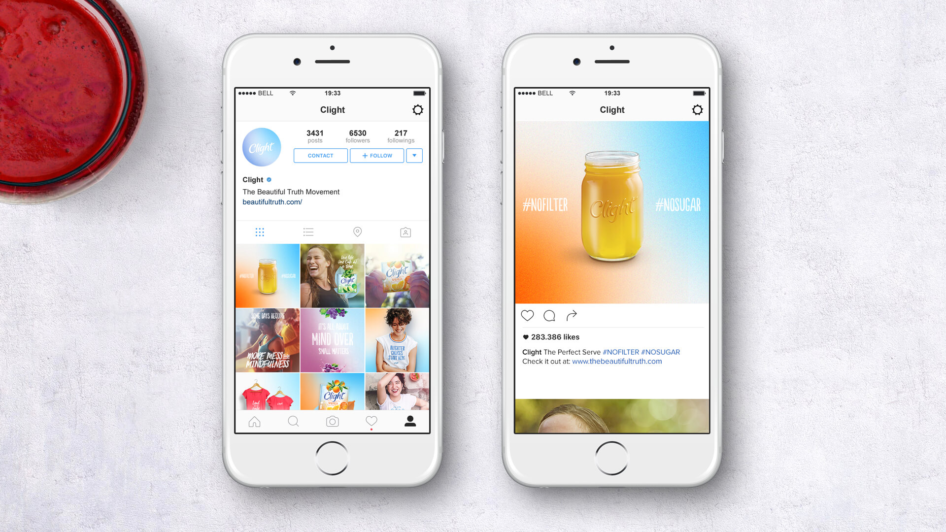
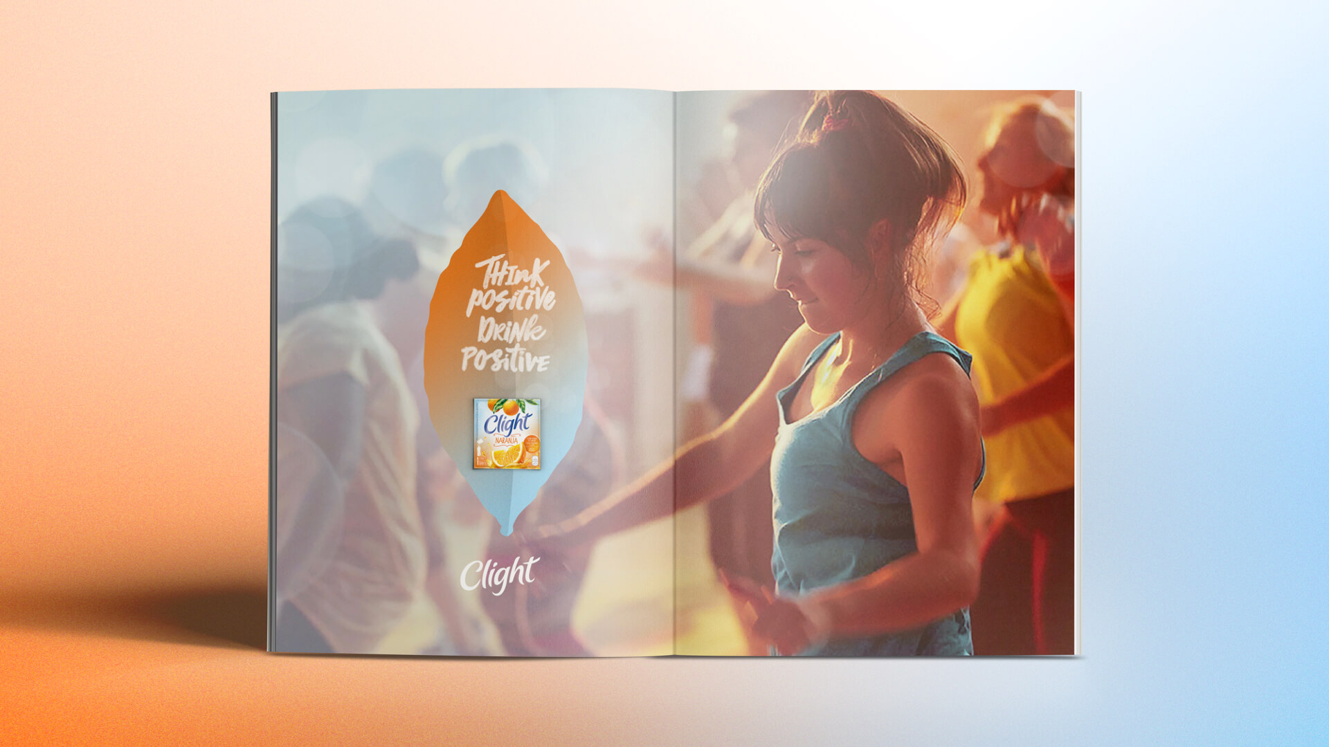
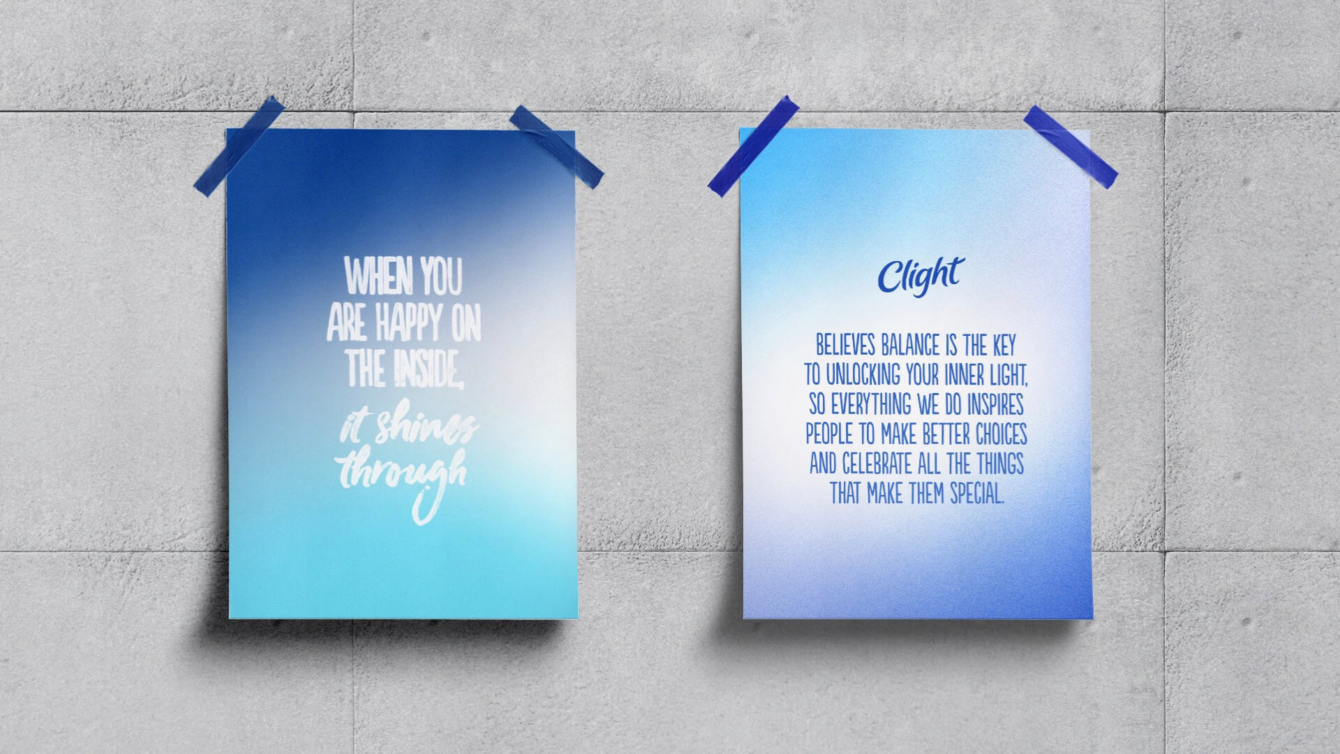
Thus, we bet on the union of two different colors forming the gradient, as a metaphor for Clight’s mission: to combine convenience and flavor (fruit colors) with the well-being of what is good for people (the blue of the brand).
Our goal was not only to create a language, but also a movement which celebrates the truth and also the possible, reachable, and real well-being that fits in our lives. Clight is the movement that celebrates the day to day emanated beauty.