


Works
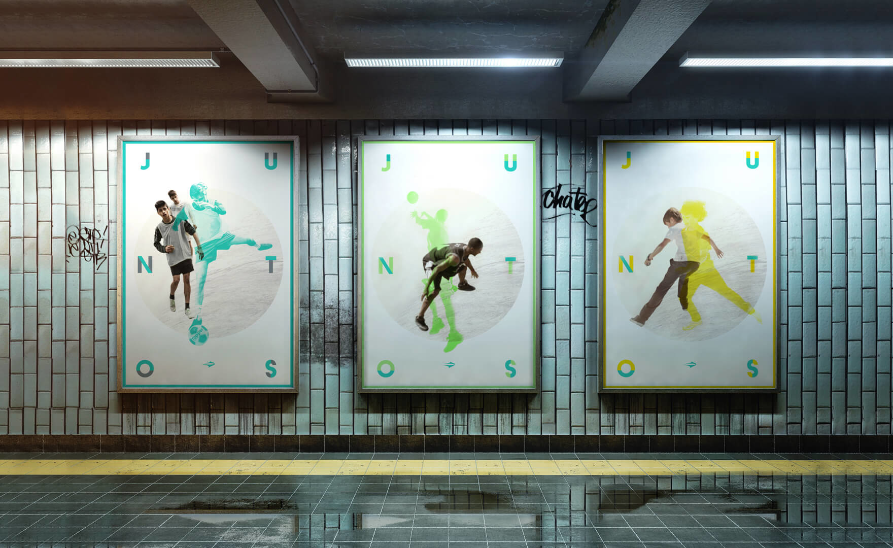
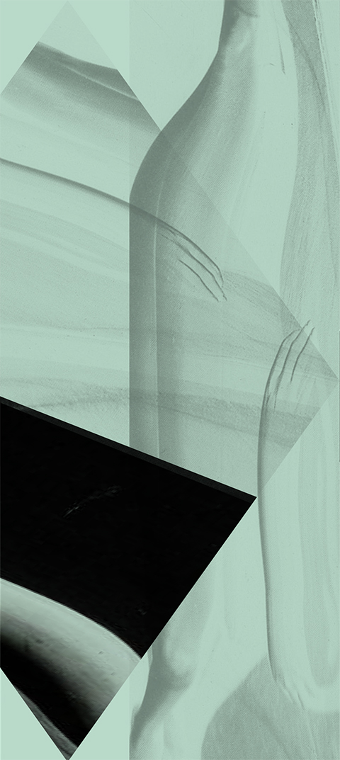
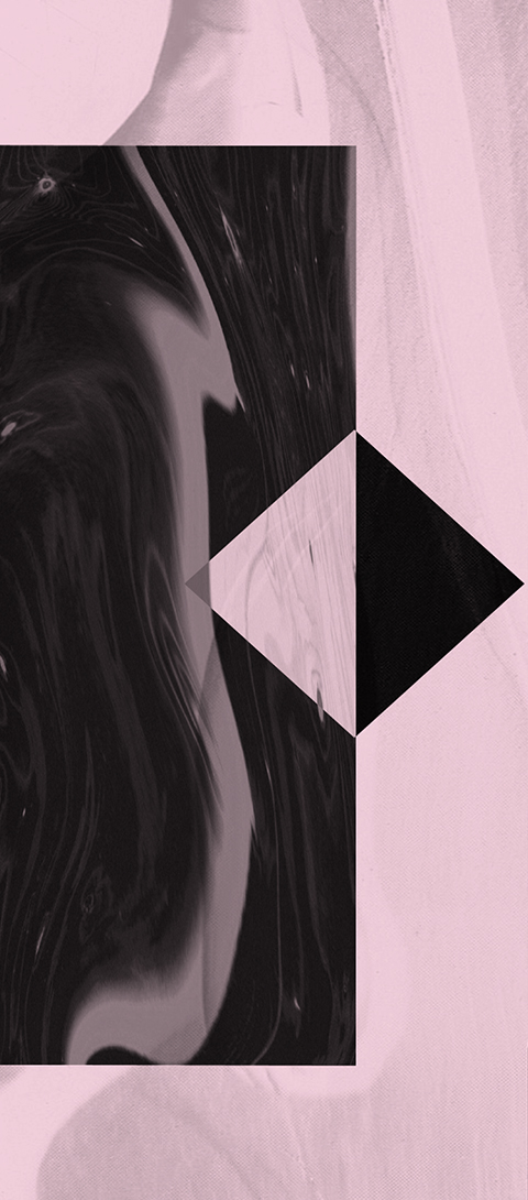
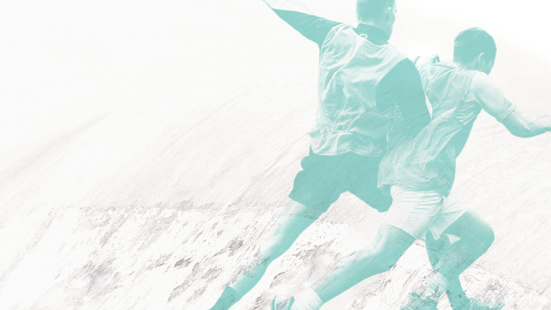
According to a Brazilian saying, “union creates strength”. It was with that war cry that Topper invited us to create a new positioning and visual identity for the brand. An identity which reflected sport as it happens in real life, with more collective spirit and less of the hero-creating.
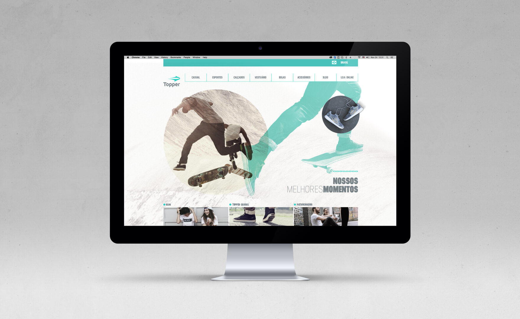
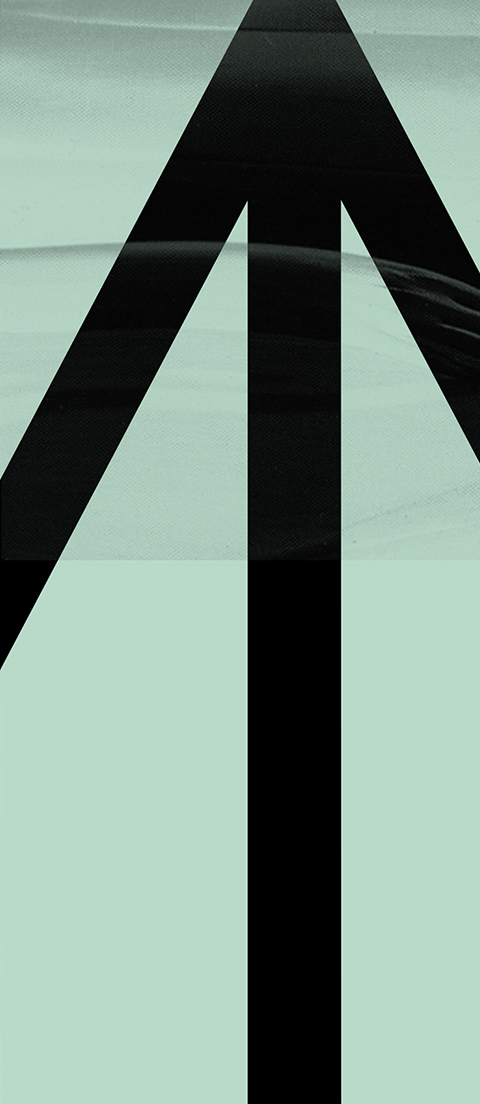
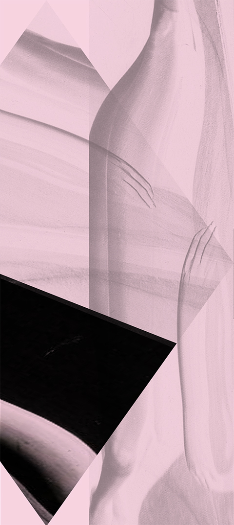
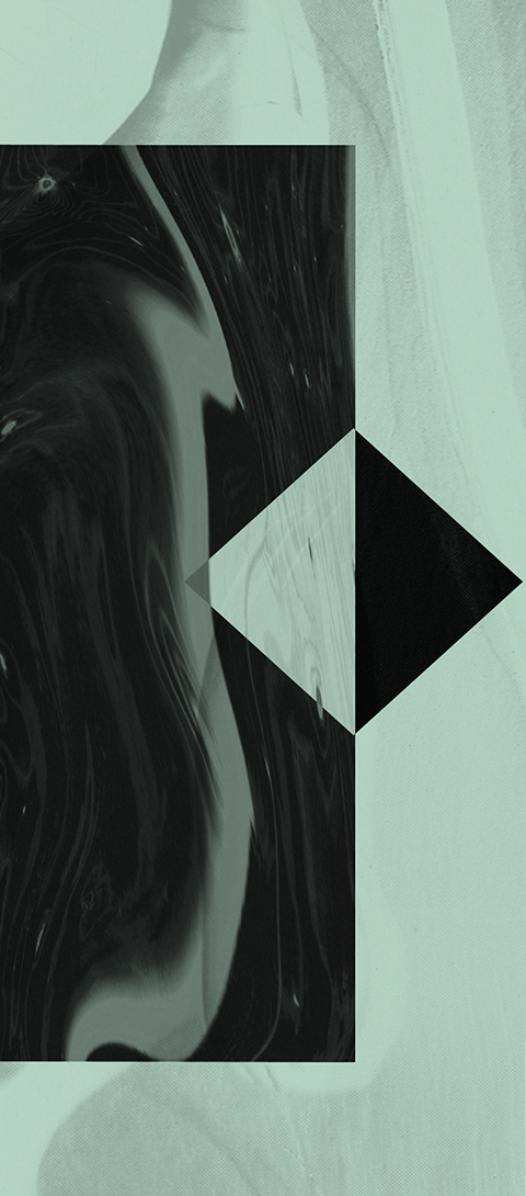
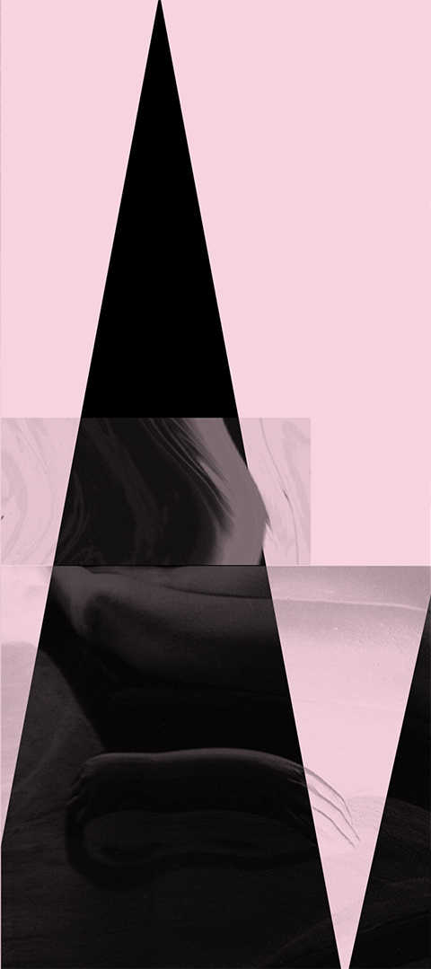
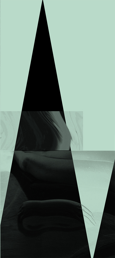
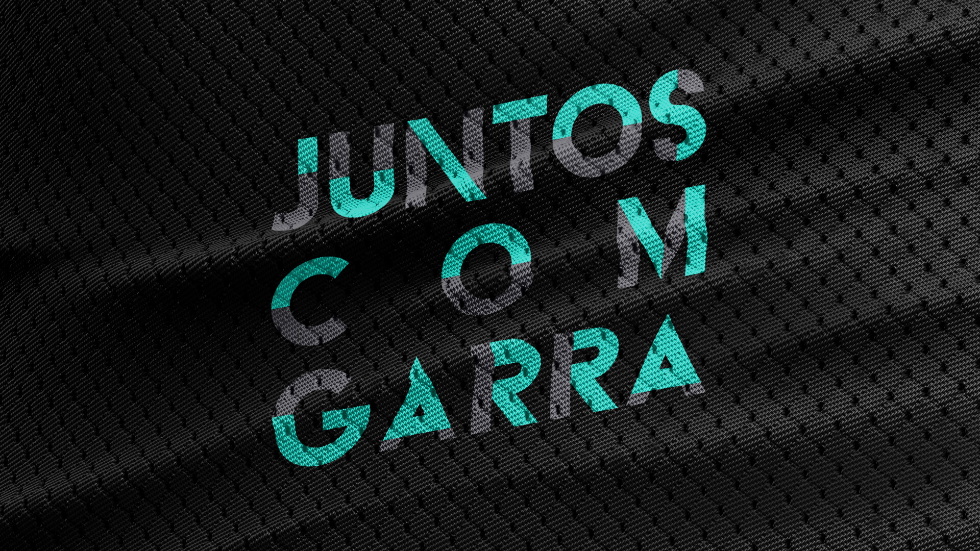
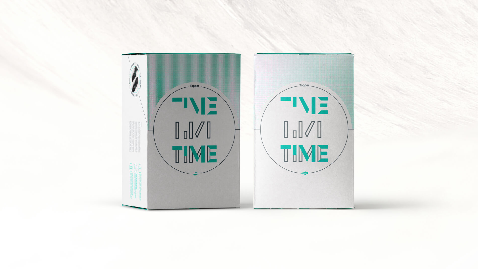
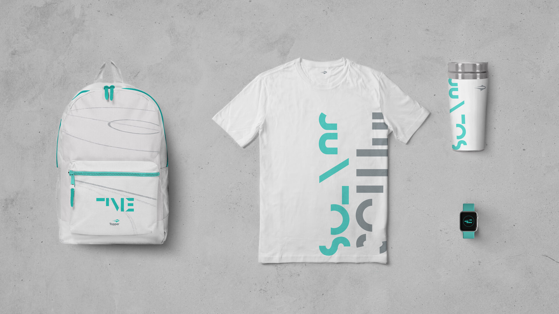
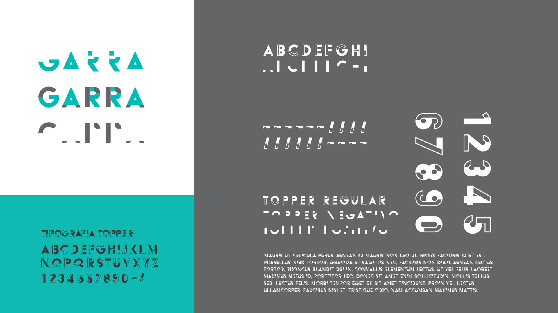
Therefore, the sum of elements is present in every centimeter of the project, the minimalism in the curves and the presence of more than one element in each piece, even if discrete. We developed a modular typography that breaks down into single pieces yet they all fit together: it works on its own, but works better together, as a team.
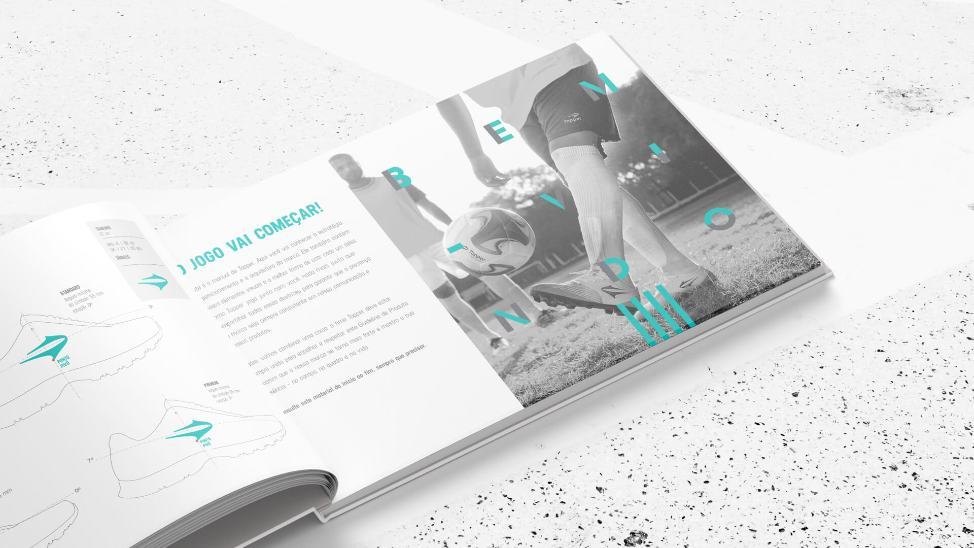
This collectivity concept has led Topper to find a territory of its own in the competitive game of sports brands, promoting the team as a whole, whether on the court or in life.