Works
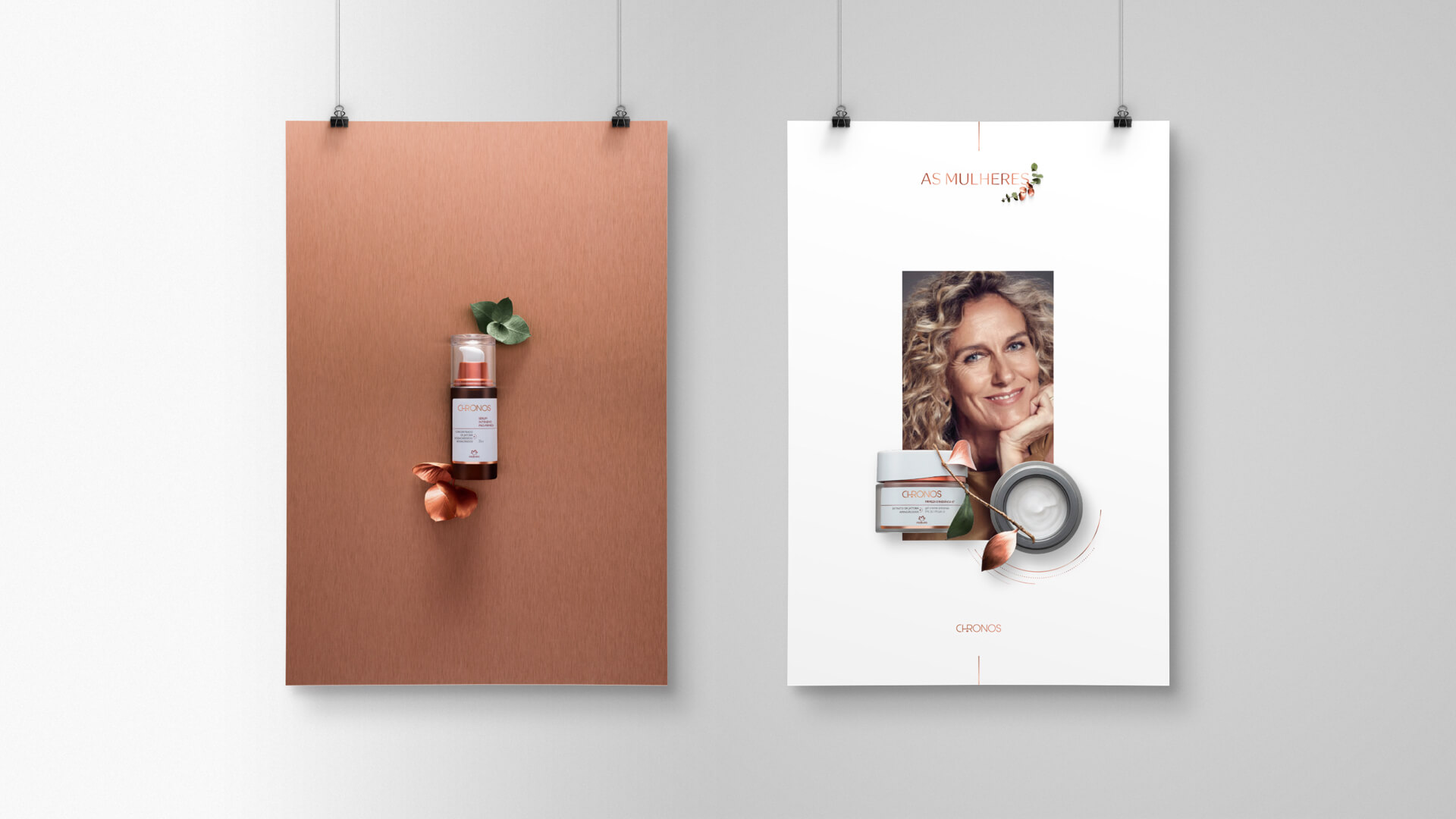
How to portray the beauty of women? How to preserve it, when it changes so much throughout time? That was the briefing Natura gave us: to rescue the essence of Chronos – one of its oldest and most iconic brands.
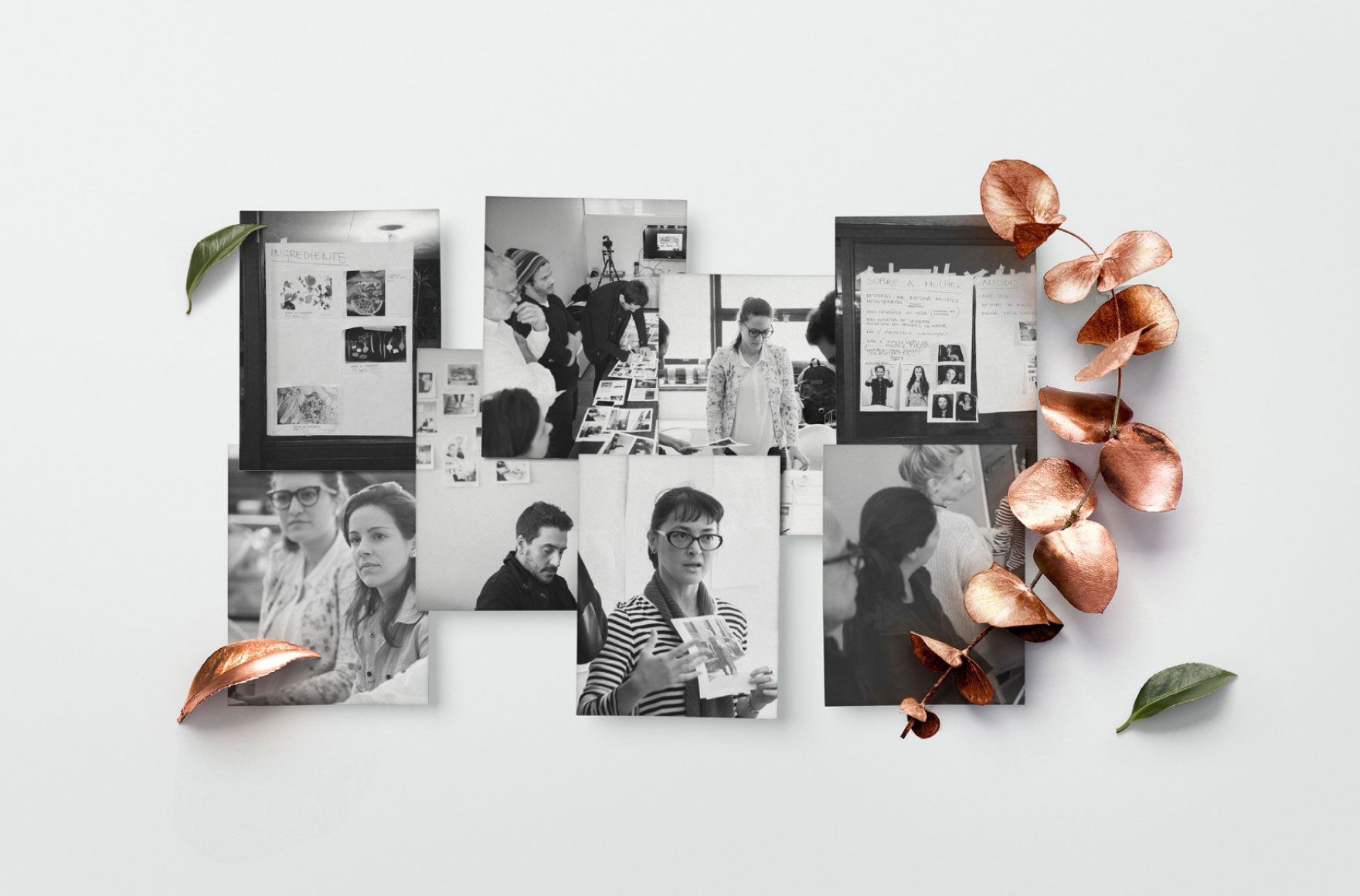
Planning began with a deep understanding about the woman herself, from the needs of every age to the needs of every skin. The process was 100% collaborative. We promoted creation collectives with market experts in styling, photography, casting and art, discussing image and content so that Chronos could connect with all women in a true and more genuine way.
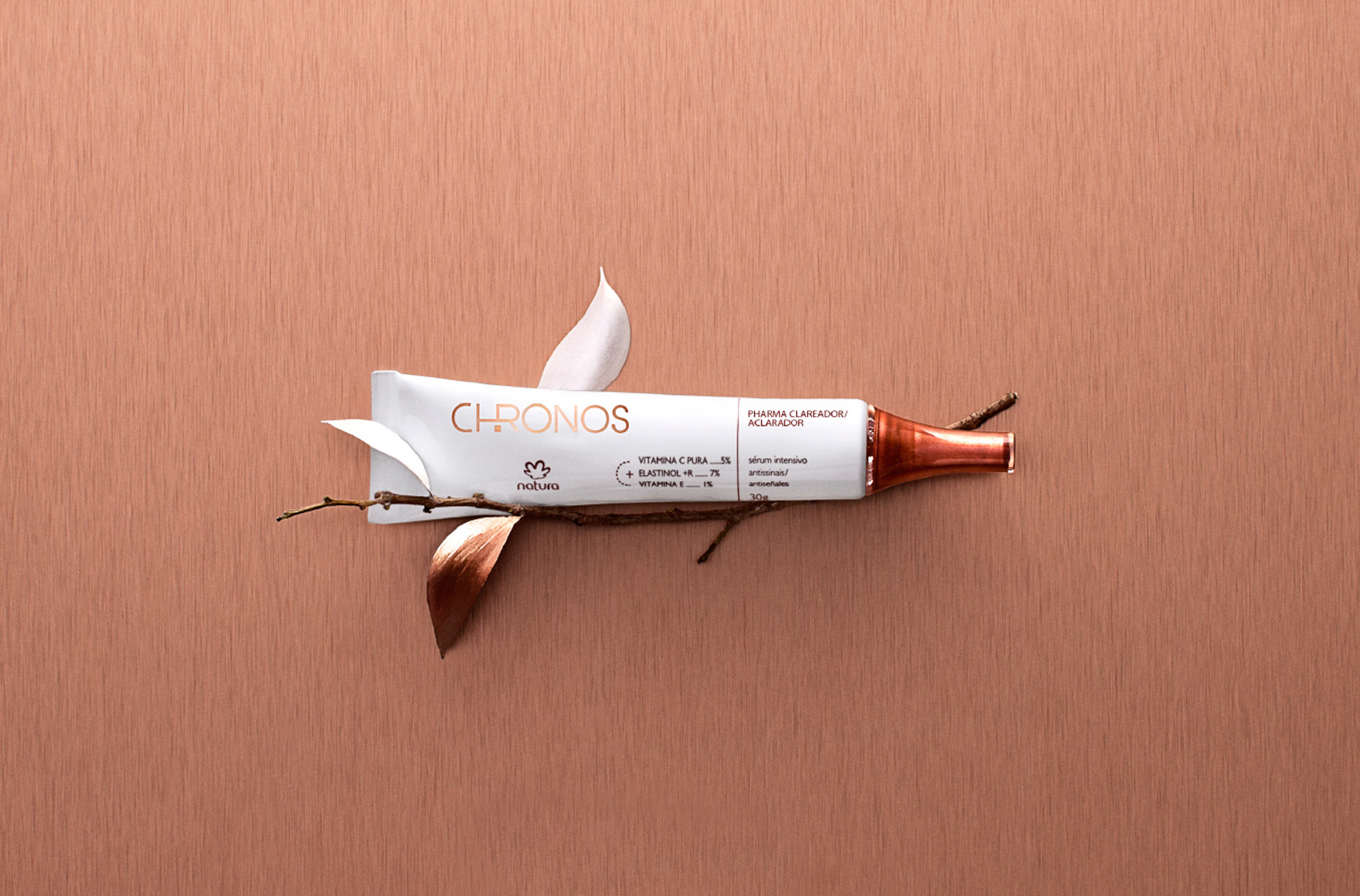
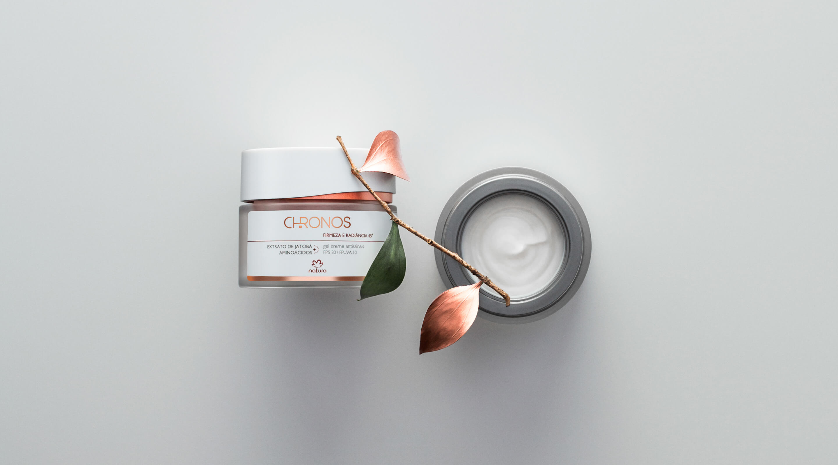
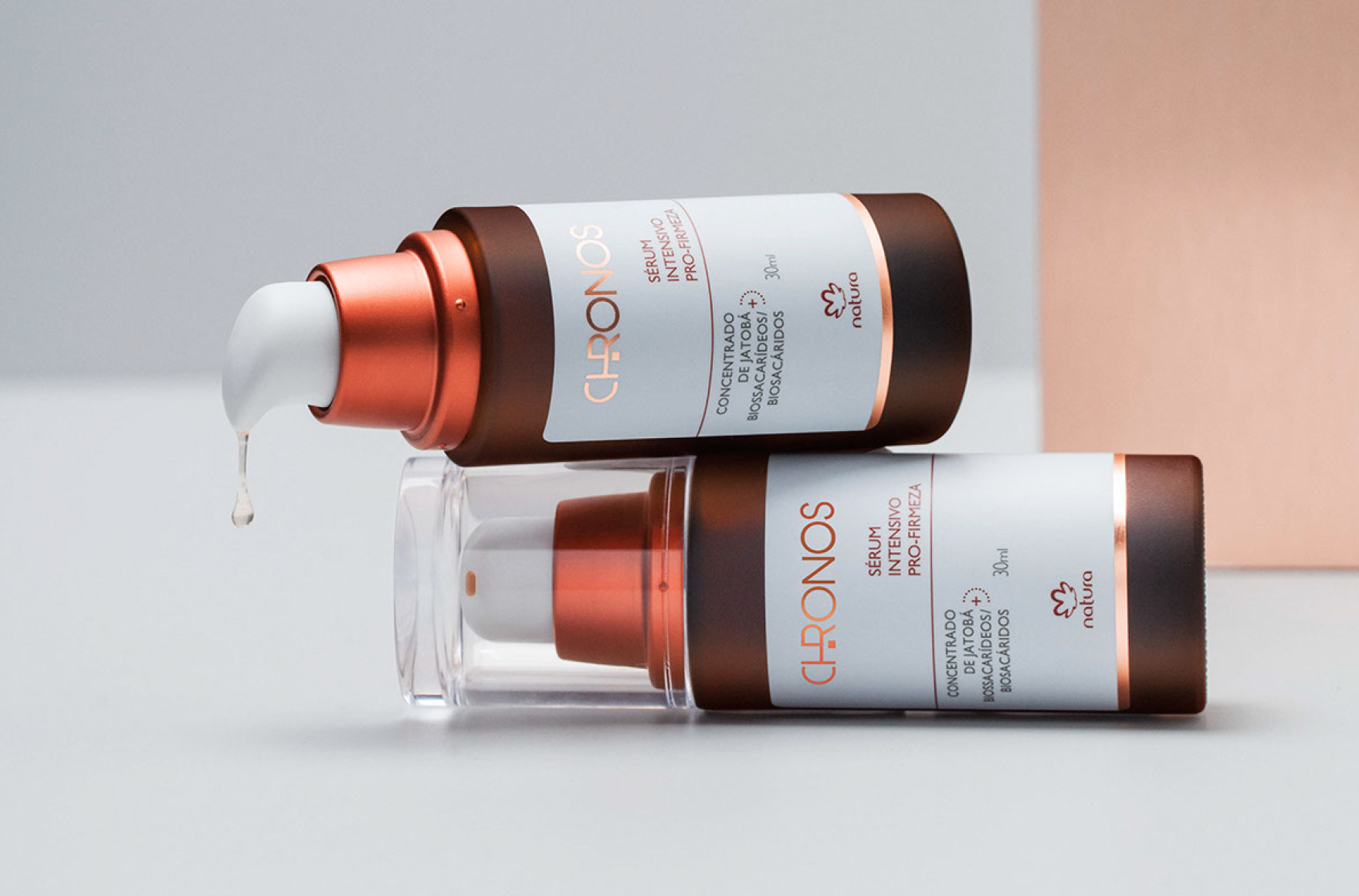
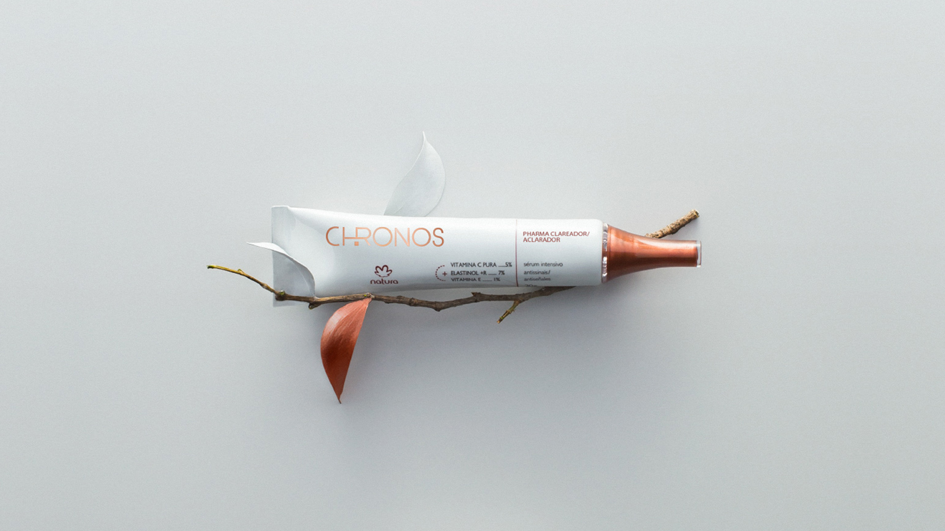
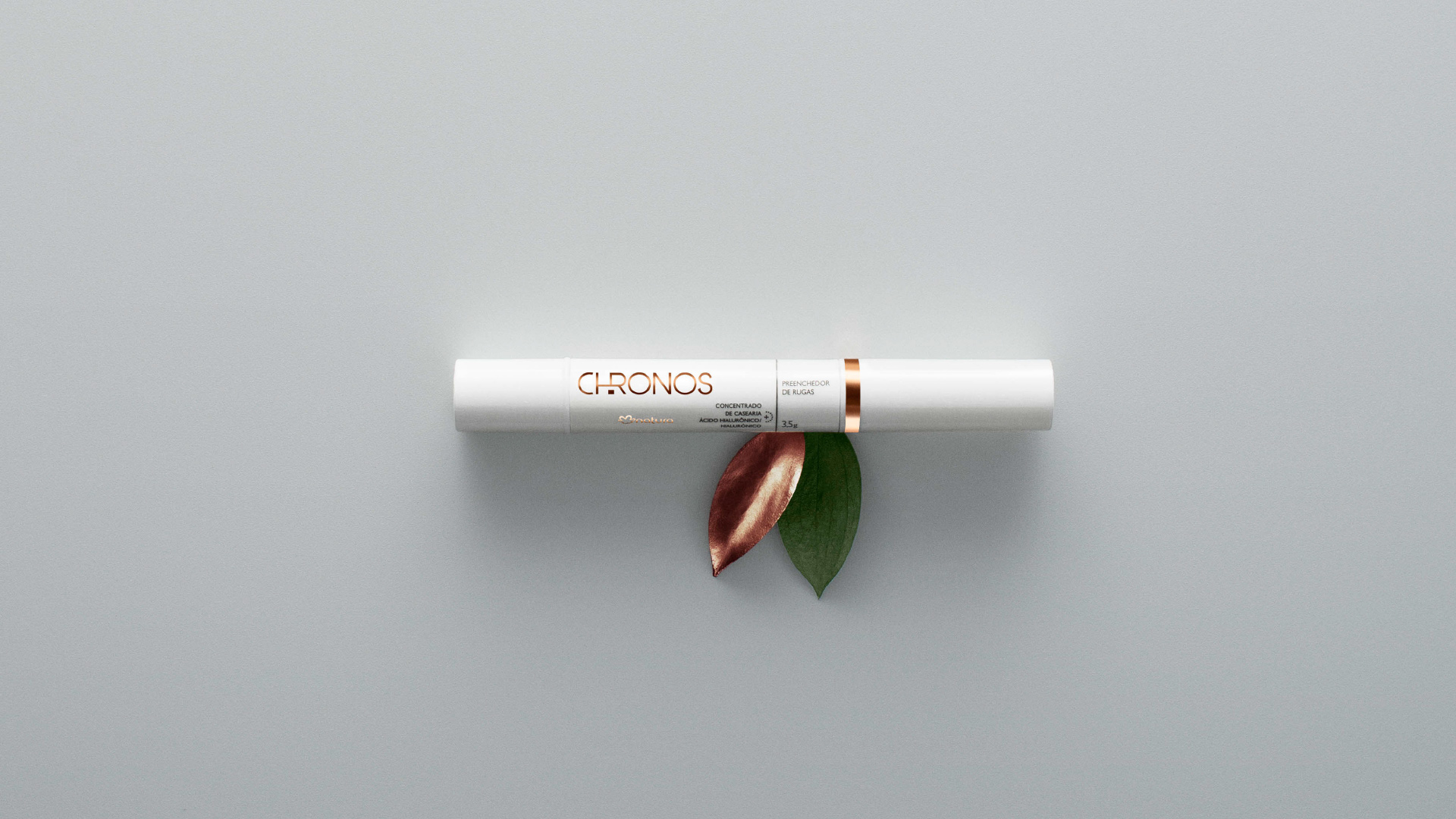
During creation, we rescued the first Chronos logo and made a typographic redesign, making it modern and essentially true. The packaging and graphic design was inspired by insights of the aesthetic encounter between therapeutic cosmetics and dermocosmetics.
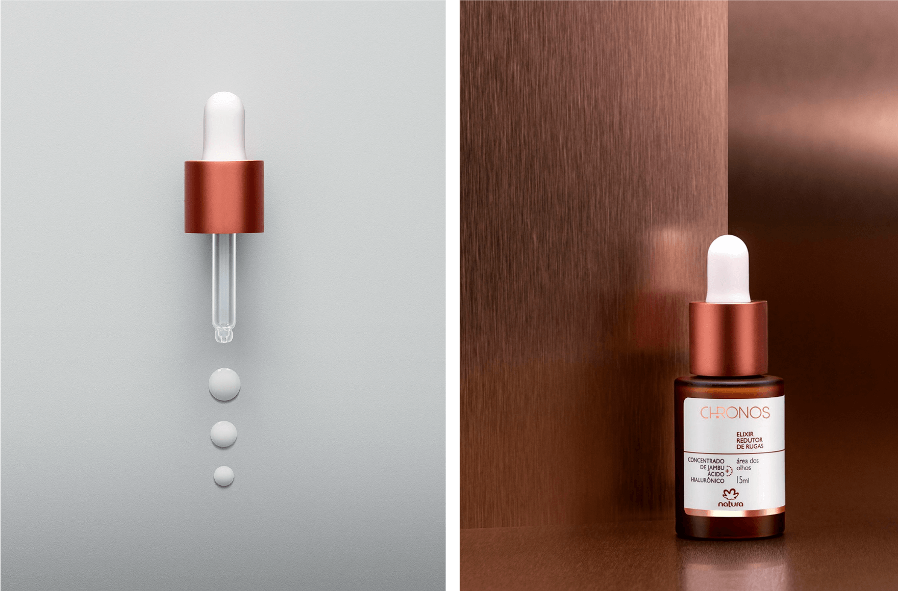
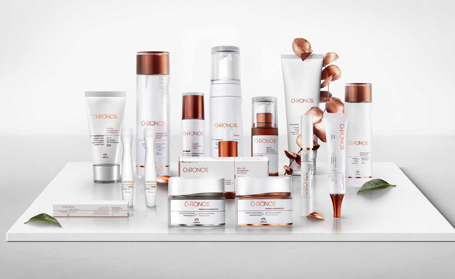
In its brand language, copper is the main element: we have chosen a metal which changes color throughout its aging process, yet remains beautiful in all its phases – same as the female beauty. Nature’s encounter with science is represented by metalizing the leaves of the actives.
The re-launch of Chronos went in hand with the re-launch of Natura’s brand language, conveyed in all major media. Certainly a milestone in its story.